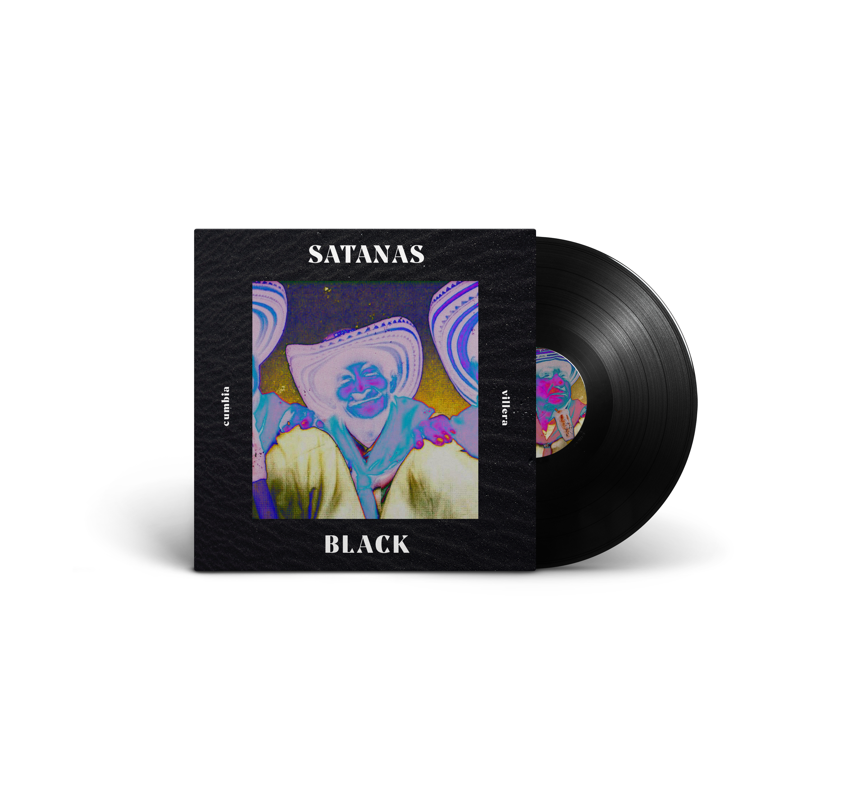
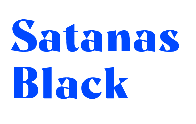
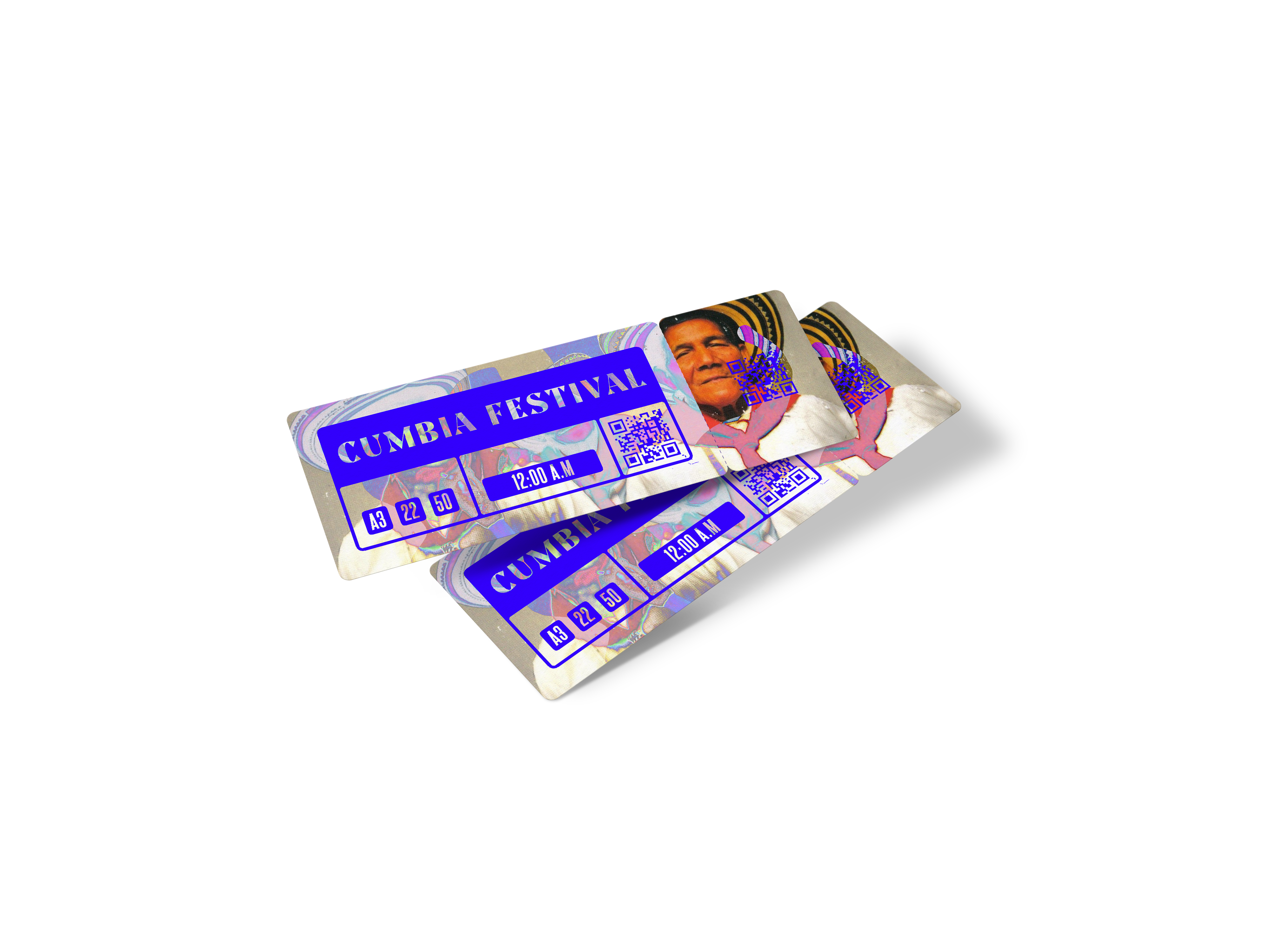
Inspired by the bold energy of the Cumbia song “Satanas”, I developed a characterful typeface that is loud, curvy, bold, spacious, and full of quirky details.
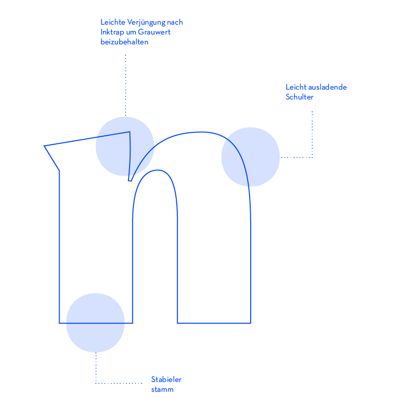
The process began with analog experimentation, deep research, and a hunt for visual references with a similar feel to my target aesthetic, which was loosely based on the typeface Noe. I refined the concept through iterative sketching, brushwork, and eventually moved into digital design using Glyphs.
While the pace was demanding, I embraced the balance between intuition and precision, ultimately designing not only the full set of lowercase and uppercase letters but also punctuation, diacritics, and numerals.
This project taught me to appreciate the complexity of type design — from subtle serif curves to spacing logic — and pushed me to grow creatively and technically. What started with uncertainty ended in a typeface I’m genuinely proud of.